
A Question of Colour
 Toni recently rebuilt and upgraded an online store she had built for a client some years ago.
Among the things that were to be changed during the rebuild were the two principal colours and the client decided that she would like yellow and purple.
Of course there are many shades of yellow and purple so the client even went so far as to send Toni a swatch of each colour so that Toni could incorporate the exact shades that the client wanted.
When the rebuild was finished Toni went over the site with the client and once the client was happy Toni breathed a sigh of relief and moved on to the next project.
Today, three weeks later, Toni got a phone call from the client … the yellow was not right and nor was the purple and the client had the colours that would be right … except they weren’t.
When Toni changed the colours on the website to the new shades that the client had sent over they still weren’t right. The client now felt that the replacement yellow was too orange and the replacement purple was almost grey.
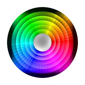
While the issue of what is the right shade of yellow and purple are still to be resolved now might be a good time to talk about colours and what are some of the things that can influence how we see a colour.
Maybe it’s the monitor
Walk into any department store or Office Works and take a close look at the display of computer monitors.
If they are all switched on and showing the same screen you quickly see that different monitors apparently deal with colours differently. In some cases that may be so but often the problem is caused by the way the monitors have been calibrated.
Look at the controls that come with your monitor and you soon see that you change the way colours appear on the screen. If someone has played with those controls or if the monitor isn’t calibrated at the factory there will be quite a difference in the way colours on the screen are displayed.
And things can get even worse when you look at colours on your tablet or mobile phone.
Maybe it’s the company a colour keeps
Even if your monitor is calibrated perfectly you can still see various shades of colours on the screen that aren’t quite what they really are.
When you have two colours adjacent to each other what you see with our imperfect eyes in one colour maybe influenced the colours adjacent to it.
The colour displayed on the screen may be the correct colour but what you actually see may be lighter or darker than it really is because of the colours around the one you’re looking at. It’s called adjacency and it can be a major problem.
Overcoming the problems
This link will take you to an article on a website that will walk you through the steps you need to take to correctly calibrate your monitor.
Overcoming the problem of adjacent colours influencing how we see those colours and what impact that will have on your website is something that is best discussed with your web designer.